Monday, 27 April 2015

Evaluation Part 3

Media technologies in the construction, reseach, planning and evaluation stages were essential.
Learning new tricks on each different program I used and ensuring that everything look very professional was probably the most difficult element of using any of the new media technologies, however in the long run it improved my abilty to immeditatly search for a media product that I needed - for example in the beginning of the research proceedure it allowed me to search trailers on youtube.com and towards the end when it came to ultimatly posting all of my finished work I could load up blogger.com.
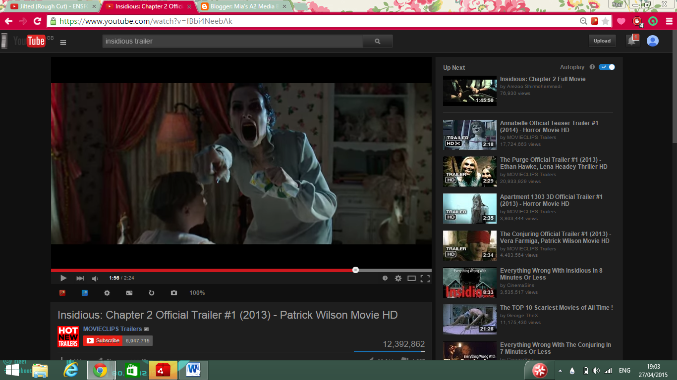
Here are some examples that I used Youtube for - 3 horror trailers that influenced my work:


                                            Black Swan


                                            Insidious

                                            Grave Encounters


Youtube was the website that I used the most during the research element of this project as like I said it was instant research products at my finger tips whenever, whereever I was. Although Youtube is perfect for the visual and audio aspect of research I found that imdb.com was the best website for finding out about auteurs such as Darren Afronosky as it is much more discriptive about each persons line of work and the products they have previously made or been involed with. I found that actually these two websites worked well as a couple - I found myself searching for directors/producers/actors on the imdb.com page and then watching clips from what I found on youtube.com.
                      
Another useful form of media that I found myself using was simply DVD's. Within my research I watched The Wrestler, Black Swan, The Blair Witch Project, Insidious, Psycho, Dawn of the Dead (2004), Dawn of the Dead (1960), Grave Encounters and Posession in order to really capture the effects used within horros and understand the forms and conventions used to create certain emotions. 

When learning about differnet types of horrors I wanted to ensure that I was selecting the correct horror type for me. To do this I used Wikipedia to learn a little more about what 'body horror' and  'psychological' was and the difference between a horror and a thriller.


Construction: 

In order to create my ancillary products and my main products I needed to use new media technologies to a 'more skilled' level. This was hard for me as I have never used a lot of the websites or programs before and so learning was all part of the process. 

For my magazine and poster I used Photoshop


I used the lasso tool on Photoshop to crop my main image so that it fitted with my model in the middle of the cover in order to to create a sense of symmetry and professionalism. I also tweaked with the colour balance, brightness levels and vibrancy to dull it down at parts and do the opposite in others in order to draw attention to certain parts. 


Here is a printscreen of my magazine cover on Adobe Photoshop. One of the first things I learnt to do was use the FX button in order to add a drop shadow and glow over my text in order to create mysterious yet exciting atmosphere. As you can see on the right hand side of the image there is a list of layers. I had 27 different layers that were all put together to create my product - each layer was tweaked differently with different effects to create certain visuals. For example, my text - the words 'THE EYES HAVE IT' started off looking like this..

As you can see it looks very bland and wouldn't catch a consumers eye. To deal with this I played around with the effects: stroke, outer glow and drop shadow to enhance this certain part of my piece. 


After playing around with the 'noise' and 'opacity' with all three of the effects I chose to use my text looked far more powerful and interesting.


I used a site called Dafont in order to find the font for some of my texts such as my title for my film Jilted and the word 'SILVER' to add complexity to my cover.


I also used Premier Pro in order to create my final product for my horror poster. 

Blogger was used in order to evaluate my products. This allowed me to save my work in a safe place and update it from any media outlet. It also put my work out in front of a worldwide audience which led to me getting feedback on simple things such as my overlay and back ground on this site in order to create a more expert appearance. This site also allowed me to do the same for my peers which I felt helped us all as a group. 
I also used a social networking site - Twitter - to send photos to Seraphina to transfer photos directly from my Iphone onto the college computers for easier access and the ability to edit. 


For my main product I used a program called Adobe Premiere Pro. Here is a screen grab from the editing software while we were in the process of merging shots together and tweaking the audio in order to make sure that everything was heard clearly and created the right effect.


As you can see our trailer was composed with over 40 shots and we carefully added them together to maintain continuity and also to build excitement and tension. The shots which are pink and those that you can actually see are the intertitles. We used those to break up the images and express the narrative of our film in a visually appealing way to give the audience a clear understanding and mental 'break' from the actual filmed images. 
The green blocking parts are the audio aspect to it. As you can see the straight horizontal line is slightly different on some of the blocks. This is due to us having to play around with the different audio balances in order to ensure that some parts, those that we wanted the audience to hear clearly and concentrate on, were louder and therefore more powerful and hard to ignore. - here I am referring to the part where I whisper into Sams ear and the moment when Seraphina talks.
Looking at the bottom screen grab and on the left you can see a faint line - this is the general cropping element. 

The first bracket which looks like this --> { was used to tell the editing software where we wanted to crop the beginning of our recording and the button next to it --> } was to crop the ending of the video. From here we simply just dragged it down to the panel of blocks and placed it where we wanted it before rendering it all to ensure that it ran smoothly. 

Evaluation Part 2

The combination of my main product and ancillary texts:

There is many different advertising techniques that film distributers will use to sell their product. However, it is very important that you get the correct form of distribution to the correct type of person depending on their age, gender, likes/dislikes etc.
For my film Jilted I felt that my target audience would be mature teens and therefore I felt that my ancillary texts work perfectly for my film due to my stereotypical fan/target audience would be the type of person to look at advertisements such as magazines. The magazine idea is ideal for my film distribution techqnique because a magazine is exactly the type of medium that teenagers regually come into contact with - this is the same for my horror posters. As a memeber of society we are all exposed to adverts and posters etc all the time and so both of these advertising forms work well with my film.

Below are two oringial examples of a horror poster and a horror magazine that are similiar to my own products: 


Side-by-side magazine analysis: Key aspects.


Structure - As you can see the 'Total Film' magazine cover is structurally very similar to my 'Silver Screen' magazine cover. They are both fairly classy and convey conventions much closer to psychological horrors, compared to magazines such as 'Scream' that focus majorly on body gore and therefore take on a much more 'frantic' and packed structure. Both of these magazine covers above stick to the 'rule of thirds'. Both of the main images are situated in the middle third to emphasis its importance and highlights the main feature within the magazine itself. The top third included the title as well as a short 'tag line' for the magazine - "THE MIND-BLOWING ISSUE"/"THE WORLD'S MOST UPMARKET HORROR ENTERTAINMENT MAGAZINE". The top third of a magazine is usually what the consumer will see first due to how they are placed on selling stools and therefore its very important that the viewer will see the title first to help advertise the product. The bottom third for both magazine is filled with further information on our main image and again highlighting what the main feature of the magazine is. 
Colour - Both magazines use dark, 'moody' colours which are conventional for horrors. Deep blues (used on 'Total Films' cover) share the same colour connotations as blacks (used in my version of a horror magazine). They both connote power and dominance as well as hinting towards a gloomy, mysterious atmosphere. They both also add to the 'classy-ness' of the cover due to the colours themselves not being too overwhelming, confident and messy. They also symbolise the idea that these magazine articles are focused mainly on 'psychological horrors' - INCEPTION/JILTED. If my horror film was known for its gore content I would of used colours like red and yellows to connote blood, pus and danger. 
Cover Lines - The cover lines are strategically places around the outside of the magazine on both covers. This is to not draw too much attention from the main image/main article however they need to be advertised on the cover so that the consumer knows what they are buying and can look forward to reading ahead. Most 'important words' such as producers names, film titles and 'juicy'  topics are bigger than other 'connecting' words to create emphasis on them and capture the viewers attention.

Side-by-side poster analysis: Key aspects.

Colour - As you can see from the example of another horror films poster and my version of a similar kind of film the colours on my poster are much brighter. I feel as though this is because my aim while making the film was to sell to a more mainstream, modern audience and so I felt that brighter colours would catch a 'younger' persons eye within our generation better than a more 'old-fashioned' type of horror fan.  The colours on my poster also, also very similar to the example poster, add a sense of 'money' and a 'high quality feel' to it, whereas I feel as though due to the fact that the example poster is much duller it conveys the idea that its more 'inexpert' and 'unprofessional'.
Structure - The structure of our horror film posters are extremely alike. We have both placed our title - TAROT/JILTED - within the bottom third of the poster and situation our key elements of our main image - the tarot cards - in the middle third highlighting its importance and simplicity. We have also similarly placed our actors names just slightly about the title to advertise their presence and attract audience members that are a fan of the actors/actresses previous work. The only major difference between our two pieces is that I have placed a  tag line in the top third of my film poster to add dramatic effect. The idea behind a tag line is to create an intense phrase that will strengthen the audience's memory of the product and also to slightly sum up the narrative or tone within the film itself and therefore I felt it was highly important to include one to capture and hold the audience's attention and make them want to see my film.


Horror poster                               Horror magazine                               Trailer Still

As you can see both my horror magazine and horror poster have been heavily influenced by my actual trailer. The use of the tarot cards I felt added a sense of mystery as the whole illusion behind tarot cards is creepy and although unrealistic, its highly believable. The eyes from the Silver Screen magazine although are not directly linked to either of the other images/products they connote a deeper meaning. The idea behind tarot cards and a 'fortune teller' is that he/she can see into your future. The use of the eyes on my magazine cover connotes this idea and subtly symbolises that we are always being watched and that someone always knows what we have been up to but in a classier, much more psychological, creepy way. 
Also, as you can see each image is focused on one simple thing or person. This is because I wanted a sense of isolation and loneliness to be a subtle but reoccurring theme. The genre horror itself is about digging into our fears and one of them is of course abandonment and/or the sense of being isolated and therefore portraying it on each of my products I felt was important to attract the right type of audience member. 
The genre itself is known to draw in those that do not 'fit in' with the natural cultural dominant ideology (CDI) and so I needed my form of advertisement to link to this well-known fact. In Dawn of the Dead (2004) the main protagonist of the film, who acted as a hero, was a black male which almost challenges the usual CDI. With this in mind, I placed Seraphina - a 'non-white', 'non-black' actress as the main image of my horror poster even though it probably made more sense to have Samuel Lee - the main protagonist of my film trailer - as the main image but I wanted to challenge the usual convention of a normal magazine and isolate it to a pure horror magazine.

Evaluation Part 1

My horror trailer developed many of the forms and conventions of the horror genre. The first form and convention we focused on was cinematography. We used a wide variety of shots however we tried to pack our trailer with many close ups and canted angles. My reasoning behind this was that not only are both techniques highly conventional within the horror genre but I find the reason behind this very effective. Both close up shots and canted angles created a 'weird' view for the audience and, as usually we don’t invade one another’s space, nor look at one another on an obscure angle, it 'messes' with our mind and adds to the element of uncertainty and 'weirdness' I feel a horror trailer should have. We made sure these weren't the only shots we took into consideration and so we used a range of medium and long shots too - this helped keep our trailer exciting and entertained our audience as the same kind of shots from the same angle would have been highly boring to watch. Another form an convention I feel we used quite a lot of was a 'hand-held camera'. The idea behind this came from a film both me and Seraphina watched in order to spark some ideas - The Blair Witch Project. We felt with this being such a well-known, successful horror film ideas from it were bound to work well within the genre of horror. The hand-held camera added a sense of panic to the trailer which I feel again is highly important within this genre because it allows the audience to feel suspense and fear which are all essential if you were to make a 'good' horror film. I feel that horror is definitely meant to pick on the audiences emotions and make them feel vulnerable and I felt that using a hand-held camera makes the trailer seem more personal - as though the audience could be holding the camera themselves or experience what they are seeing on TV in a real life moment - making the trailer seem more personal and therefore more 'scary'.

                                             
The Blair Witch Project Trailer


      Handheld still from Jilted                                      Handheld still from The Blair Witch Project


Another convention we used was a very small element of body horror. We really didn't want to use fake blood or make our horror trailer into a gory horror because our aim was to create a psychological and therefore we kept this element very small. However, I feel that a slight bit of body horror is needed to fit with the usual conventions of the horror genre. To do this - when my character dies - we used makeup to create a gaunt look on my face. To do this we simply placed some black eye shadow under my eyes with a little tint of red. We felt that the red, depending on which type of horror fan our consumer watching our trailer would be, could appeal to them either way, whether a gory or psychological fan. The red could connote blood, which would appeal to a more body horror, gory fan, but also could simply connote death, or danger and add an element of realism to my ghostly character for a more psychological viewer. The idea for the dark makeup around my eyes came from one of my favourite psychological horrors: Insidious 2


                                Dark eye inspiration still - Insidious 2


My trailer fitted well with the horror genre. I feel it is important to have a definite genre when it comes to horror as I don’t feel like films with the genre of a 'Horror/Comedy' work as they are both such opposing emotions. However - getting the genre right is incredibly important. I researched in to Thomas Schatz - a man who has written books on film making and Studio System etc. He said that "..a genre represents a range of expression for the filmmakers and a range of experience for the viewers". The element of this quote that caught my eye was 'a range of experience for the viewers'. In order to ensure that my horror trailer was going to give my viewers the best experience that could get and feel a variety of different emotions, I looked further into other horror trailers to take ideas of pacing and music in order to create the type of atmosphere I wanted. The first horror trailer I looked at was Psycho.

                                                Psycho Trailer


The first thing I noticed about this was that although the film was old -1960- it still kept to the usual forms and conventions of a horror trailer in terms of pacing. To make sure that the pacing of this trailer didn’t just work well for the period of time that the film was made, I watched a more 'up to date horror trailer' to ensure that this effect of pacing to create emotion wasn’t just a ‘context thing’. 


                                Dawn of the Dead 2014 Trailer

After watching this trailer I realised that a pacing structure of 'slow, quick, slow, jump scare' really worked well with effecting the audiences emotion as it used slow shots to a quick montage of shots to create suspense and shock. The use of collision cutting is to provoke emotion and so listening to what Schatz had said I felt that it was essential to create panic. The pacing of my trailer ensured that it stuck to the horror genre. 

I think that another thing that helped ensure that my trailer remained within the horror genre was the non-diegetic music. Music is highly important within horror - I find that if you mute a horror trailer and watch it immediately at least half of its impact is lost because the music brings such a huge amount of suspense and fear to the audience. Choosing the music was difficult because a lot of 'scary' tunes are very 'over the top' which I felt almost added a sense of ‘fake-ness’ and sarcasm to their product. I feel that psychological horrors are very classy and therefore the non diagetic music had to be taken seriously, and tweaked enough so that other audio elements could still be clearly heard. 

Auteur Influences - 

Darren Aronofsky: All of Aronofsky's films share one similar link - an element of addiction. I find this very interesting in itself and so watch a couple of his films, such as Black Swan and The Wrestler to learn a little more about his auteur work. His obsession with 'addiction' definitely influenced me with the main male protagonist within my trailer. As a character he definitely shows elements of addiction or a 'creepy obsession' to his girlfriend - ending up with his fixation on her going too far resulting in her death. 
Context - 
I feel that within our generation 'lovers' as such are quite a big element of our life. In order to make a horror film scarier I feel that an audience member should be able to relate to it and, thinking about our generation, the thing I noticed most about us all is that the majority of us are all in relationships or at least searching for one. I feel that this is where our main idea for the two lovers to argue and for the male protagonist to kill his girlfriend came from - the idea that as a generation we are all too obsessed with 'finding a boyfriend/girlfriend' that we can lose the true values in life. Therefore, having an element in our trailer that linked two people together I felt would widen our target audience as consumers tend to view things that they can relate with.


                                'Realtionship' still from my trailer.


'Jilted' (Rough Cut)

                                                   
I personally feel that from this rough cut there is still a lot to work on. The non-diagetic music in some places is in need of some tweaking as well as some of the audio containing dialogue. I really like the fight scene because I feel it adds an elemement of sudden violence so close to the start of the trailer which I feel will keep the audience on edge.

Focus Group Screening

Good Points:
- Nice montage of shots when Sam drinks the whiskey x6
- Very clear narrative x10 - the way we merge our shots together resulted in a clear understanding of the plot for the audience
- Creepy music while the inter titles were presented x5 - we were told our music choice matched the general 'weird' atmosphere for our trailer
- Good acting x6
- Varied use of cinematography x4 - good angles
- Fair use of close ups to fit the general horror convention of camera shots x5
- Pace x3 - audience members said they liked the 'fight/argument scene' as it added tension
- Good establishing shots - audience members felt we introduced each character fairly
- Mise-en-scene x4 - the tarot cards worked well
- Duration of shots x6 - we were told the length of some of our shots created a nice sense of suspense.


Improvements:
- Spelling mistakes x8 - many people picked up on our accidental spelling mistake in one of our inter titles
- Duration of inter titles x2 - this was tricky as one class mate suggested that we sped up the duration, and another said the opposite.
- Music in general needed more pace
- Audio levels on certain parts were fairly muffled x2
- Jump scare needed
- More interesting font for our inter titles x3
- Duration of some of the shots x2 - some people suggested that we needed to speed up some of the shots to create an element of panic

Marks out of 10 by 18 viewers;

8, 7, 8, 7, 7, 7, 6, 7, 6, 6, 7, 7, 8, 8, 6, 8, 7, 7

Average Mark: 7


Wednesday, 15 April 2015

Side-by-side Film Poster Analysis


Colour - As you can see from the example of another horror films poster and my version of a similar kind of film the colours on my poster are much brighter. I feel as though this is because my aim while making the film was to sell to a more mainstream, modern audience and so I felt that brighter colours would catch a 'younger' persons eye - within our generation - better than a more 'old-fashioned' type of horror fan.  The colours on my poster also, also very similar to the example poster, add a sense of 'money' and a 'high quality feel' to it, whereas I feel as though due to the fact that the example poster is much duller it conveys the idea that its more 'inexpert' and 'unprofessional'.
Structure - The structure of our horror film posters are extremely alike. We have both placed our title - TAROT/JILTED - within the bottom third of the poster and situation our key elements of our main image - the tarot cards - in the middle third highlighting its importance and simplicity. We have also similarly placed our actor's names just slightly about the title to advertise their presence and attract audience members that are a fan of the actors/actresses previous work. The only major difference between our two pieces is that I have placed a  tag line in the top third of my film poster to add dramatic effect. The idea behind a tag line is to create an intense phrase that will strengthen the audience's memory of the product and also to slightly sum up the narrative or tone within the film itself and therefore I felt it was highly important to include one to capture and hold the audience's attention and make them want to see my film.

Side-by-side Magazine Analysis

Structure - As you can see the 'Total Film' magazine cover is structurally very similar to my 'Silver Screen' magazine cover. They are both fairly classy and convey conventions much closer to psychological horrors, compared to magazines such as 'Scream' that focus majorly on body gore and therefore take on a much more 'frantic' and packed structure. Both of these magazine covers above stick to the 'rule of thirds'. Both of the main images are situated in the middle third to emphasis its importance and highlights the main feature within the magazine itself. The top third included the title as well as a short 'tag line' for the magazine - "THE MIND-BLOWING ISSUE"/"THE WORLD'S MOST UPMARKET HORROR ENTERTAINMENT MAGAZINE". The top third of a magazine is usually what the consumer will see first due to how they are placed on selling stools and therefore it is very important that the viewer will see the title first to help advertise the product. The bottom third for both of the magazines is filled with further information on our main image and again highlighting what the main feature of the magazine is. 
Colour - Both magazines use dark, 'moody' colours which are conventional for horrors. Deep blues (used on 'Total Films' cover) share the same colour connotations as blacks (used in my version of a horror magazine). They both connote power and dominance as well as hinting towards a gloomy, mysterious atmosphere. They also symbolise the idea that these magazine articles are focused mainly on 'psychological horrors' - if my horror film was known for its gore content I would have used colours like red and yellows to connote blood, pus and danger/gore. I kept the colours of my horror magazine fairly simple too add to the 'classy-ness' of the cover due to the colours themselves not being too overwhelming, confident and messy.
Cover Lines - The cover lines are strategically places around the outside of the magazine on both covers. This is to not draw too much attention from the main image/main article however they need to be advertised on the cover so that the consumer knows what they are buying and can look forward to reading ahead. Most 'important words' such as producer’s names, film titles and 'juicy' topics are bigger than other 'connecting' words to create emphasis on them and capture the viewers’ attention.

Main Differences - One particular thing that I noticed differed a lot from many other horror magazines compared to mine was they tended to have some form of circular shape on it used as an exciting well to sell another of the magazines features. 
Above are two more examples of horror magazines that have used the circle shape on their front cover - the first is from Empire and the second is from Scream.

The reason in which I didn't use this idea was because I felt it added a childish, playful touch to my product and I didn't want my target audience to be younger than at least 18 and therefore I tried to keep my cover classier and simple to appeal to a mature audience.